What is Data Visualization?
Data Visualization is the art and science of visualizing data to increase its accessibility, comprehension, and use. This method is essential for data analysis and decision-making because it enables us to spot trends, connections, and insights that are challenging to spot in raw data.
According to the IDC Worldwide Global Outlook, the total amount of consumer and commercial data will be 175 zettabytes in size by 2025. Therefore, processing this amount of data effectively will become a severe challenge.
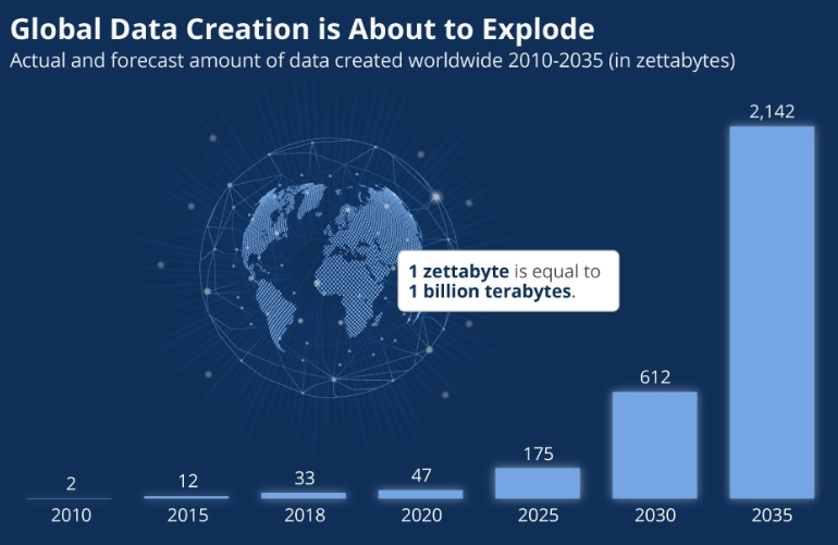
Source-Digital Information World.
Thankfully, visual information can be processed by the human brain 60,000 times more quickly than text. Moreover, the brain is skilled in interpreting patterns, spotting possible problems, and predicting future developments from understandable visual representations like well-made graphs, charts, etc.
Why not utilize your data to its full potential by using precise data visualization? For example, you may use visualization to provide your company an edge over competitors by letting the correct tools sift your data and produce your images.

Data Visualization Advantages
- Visualized data is processed faster.
Visual content is processed more quickly and efficiently than textual content. In fact, according to studies from the Pennsylvania School of Medicine, the human retina has a data transmission rate of around 10 million bits per second. According to the press release, the retina is a piece of the brain that has developed into the eye’s retina.
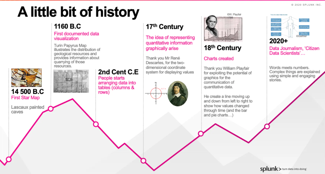
This quicker rate causes faster ingestion and processing and speedier action. The illustration below summarizes the entire history of data visualization:
- Data visualization tools show insights, causes, and trends that may be missed in traditional reports.
Gaining a better understanding of the organization can be accomplished by getting everyone in the company to view dashboard reports and data visualization. In addition, everyone can increase productivity by making raw/unorganized data sets easier to comprehend.
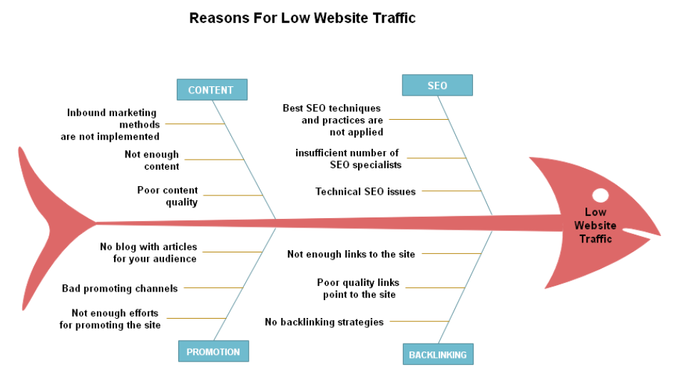
For example, You are an online marketing specialist working for a company with poor website traffic. Your objective is to identify the primary causes. The fishbone diagram below illustrates the power of a visual in identifying potential causes for and solutions to a problem.
- Data Visualization provides actionable items.
Data Visualization may help your organization see where there is room for improvement or where performance is high. Identifying successes and areas for improvement drives actionable items.
The funnel diagram below displays a website’s conversion rate: the proportion of all visitors who carried out a particular intended action (such as subscription or purchase). The chart starts with website visitors and moves through each touchpoint until the final intended step, membership renewal. Where visitors are leaving, the process is clear to see; thus, targeted actions can be designed and taken.
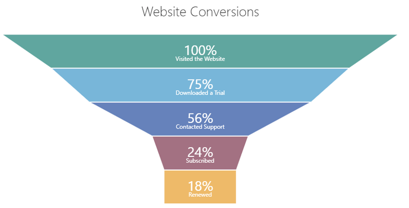
Image Source: DevExpress
- Data Visualization increases productivity and sales
The capacity to display data can significantly impact an organization’s ability to achieve successful business goals. Intelligent tools designed to help employees make wiser business decisions while on the road allows for greater productivity and focus on actual business problems rather than excess report generation.
A simple dashboard can explain all KPIs and metrics in a single place and can be easily analyzed without going through lengthy reports or copious amounts of numerical data.
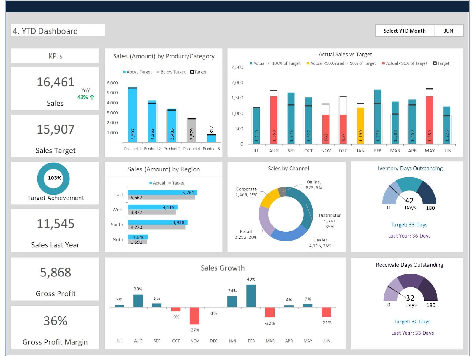
Big Data and Data Visualization
Large amounts of data can mask trends or patterns. A Data Visualization tool is a powerful ally in discovering insights, relationships, and hidden patterns from analyzing enormous amounts of data. Data Visualization is the fastest way to dig for secret knowledge in a modern data environment.
Data Visualization approaches use visual elements to display information and data, such as line graphs, bar charts, pie charts, etc. You can quickly identify trends and outliers in data by using several graph and chart types to understand the significance of data and make informed decisions. Effective Data Visualization lets you concentrate on crucial details by condensing and presenting information organizationally.
Below are several examples, features, and applications for Data Visualization formats:
- Line Graph
The line graph is the most widely used type of graph in many commercial applications. It simply depicts an overall trend.
For instance, your sales department might chart the evolution of your business’s sales at any given time.
| When are line graphs used? For example, a line chart could describe how revenue has changed from quarter to quarter or how employee satisfaction has varied from year to year. Visualizing these numbers in a line chart allows businesses to spot trends and patterns and make forecasts for the future. |
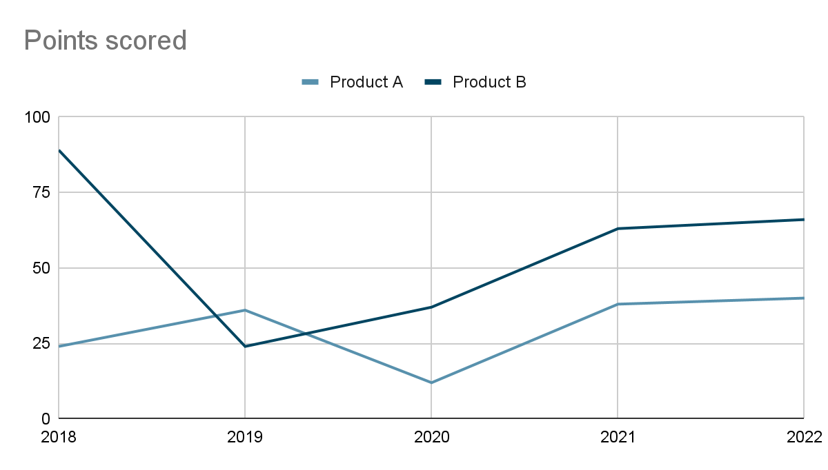
For example, the above line graph displays the overall units of a company’s sales of Products A and B from 2018 to 2022. It is immediately apparent that Product B has performed more consistently over the years, than product A.
- Bar Chart
Bar charts are one of the most commonly used Data Visualization styles because they allow for a quick scan to gain insightful information.
| Use cases for bar graphs include: Product comparisons Product usage Category comparisons Marketing traffic Marketing conversions. |
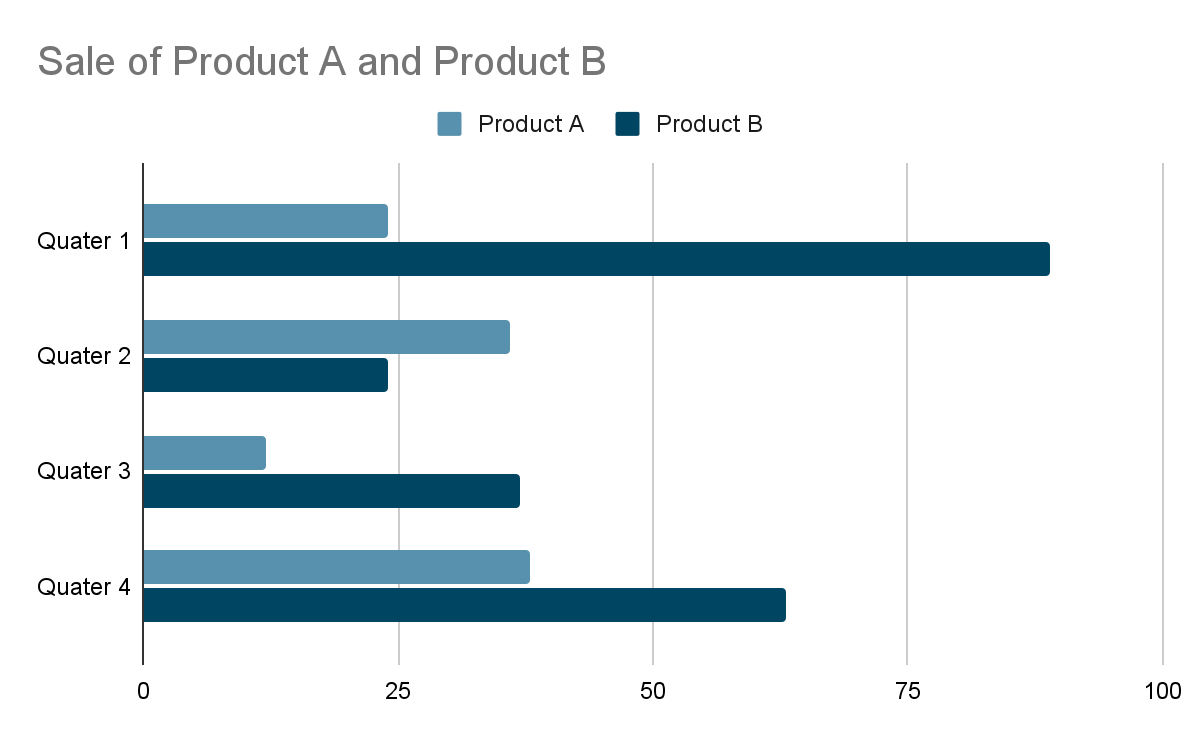
This bar graph displays the yearly sales of overall Products A and B. It is clear that sales for product B have been selling more in all quarters than that of product A
- Column Chart
A column chart is a bar chart that compares two categories using vertical bars.
The column chart is the solution if you want to compare various data side by side.
| When to use a column chart? Whenever you need to compare two values side by side Whenever you want to highlight the divergence of values When you would instead emphasize the sum of the numbers than the trends. |
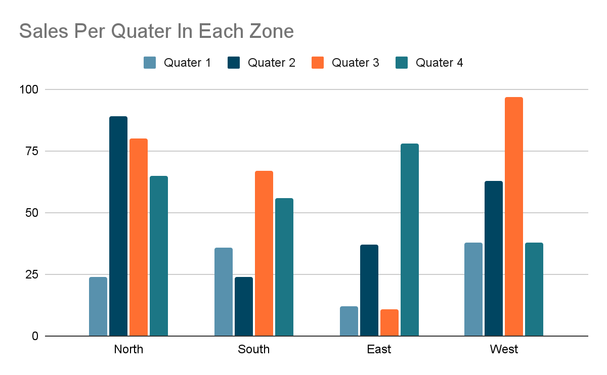
We have grouped the quarterly sales of each region into four groups in this graph: North, South, East, and West. This chart makes it simple to compare North’s sales over the four quarters.
- Pie Chart
A pie chart is a circular graph that shows the relative sizes of data using “pie slices.”
Because it depicts each component as a component of the whole, a pie chart is an excellent choice for representing percentages.
| When to use a pie chart: To Customer personas about all customers Revenue from your most popular products or product types about all product sales Percent of total profit from different store locations |
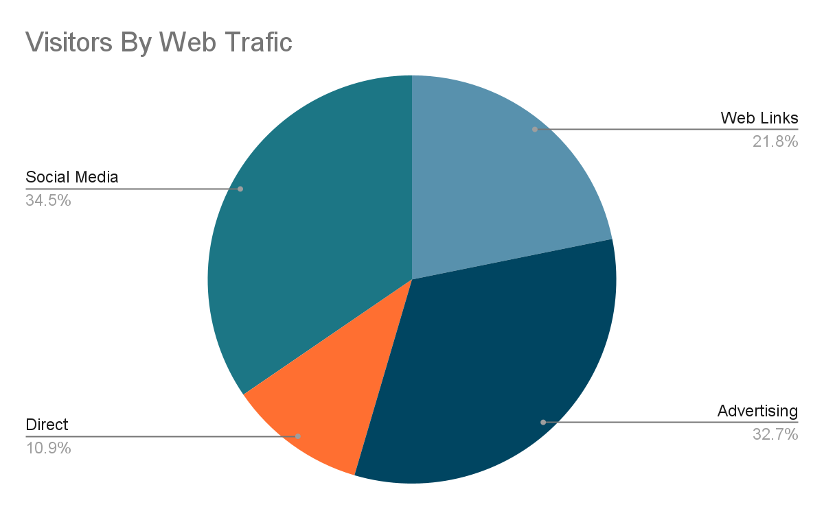
The pie chart above illustrates which traffic sources account for the most significant proportion of all visitors. Your marketing team will be able to focus their efforts on increasing the number of visits by quickly identifying what is working best.
- Area chart
An area chart is a particular kind of chart that shows how one or more quantities change over time. It has the features of a line graph.
Data points are joined by a line to depict the value of a quantity over time in area charts and line graphs, respectively. They both work well for displaying trends.
| Area graphs can help your business: Visualize which product categories or products within a category are most popular Show key performance indicator (KPI) goals vs. outcomes Spot and analyze industry trends. |
This graphic shows how much revenue and expenditure overlap in the region.
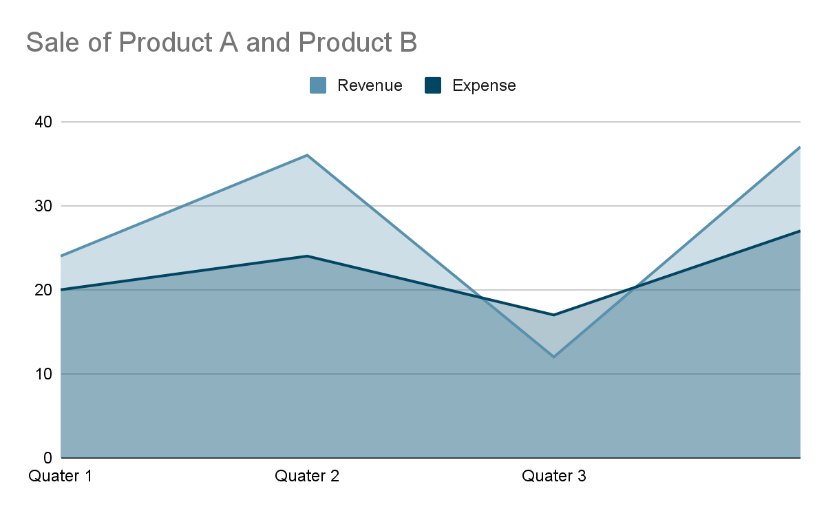
In contrast to where in the year your company just has the most cash, you may thus identify the areas where cash flow is the tightest.
- Bubble chart
A bubble chart would be helpful if you wish to visualize three connected data dimensions. A bubble chart is an extension of the scatter plot used to show relationships between three variables. The horizontal, vertical, and dot sizes at each point display the values of the variables.
| When to use a bubble chart? Top sales by month and location Customer satisfaction survey Store performance tracking Marketing campaign reviews. |
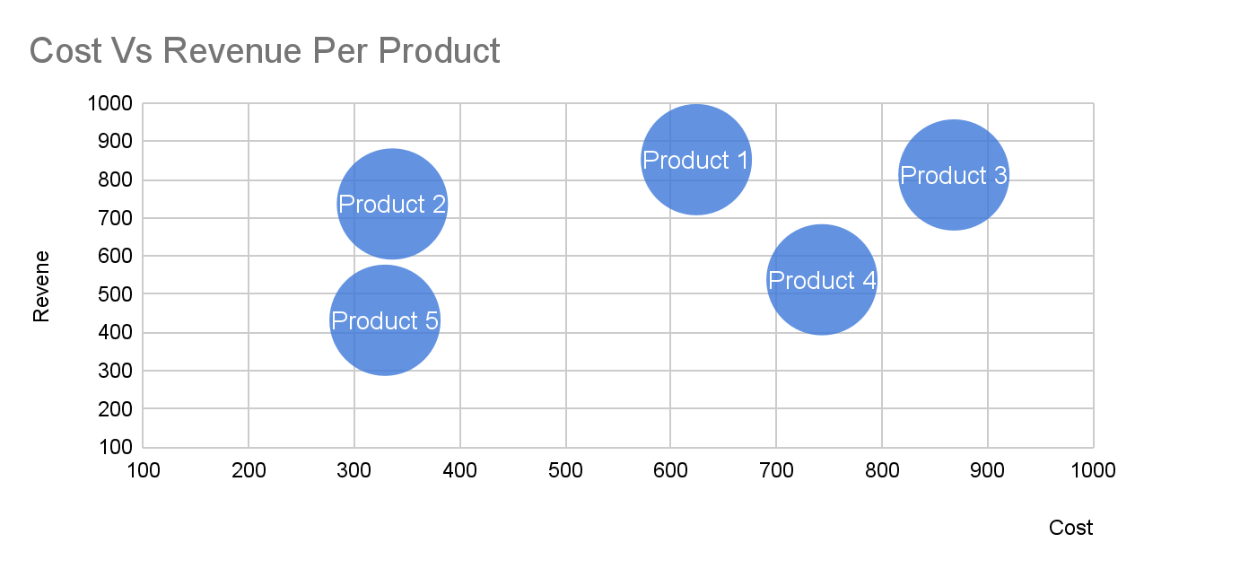
The bubble chart above illustrates the relationship between 3 dimensions of data:
- Cost (X-Axis)
- Revenue (Y-Axis)
- Probability of Success
- Map-chart
A map chart represents a land-sea area that uses the qualities of a map to define the land and the rates of a diagram to represent the sea, with other attributes that make the map chart particularly helpful in military operations, especially amphibious operations.
| When to use a Map- chart? When you want to show area or zonal market presence Geographical distribution of sales |
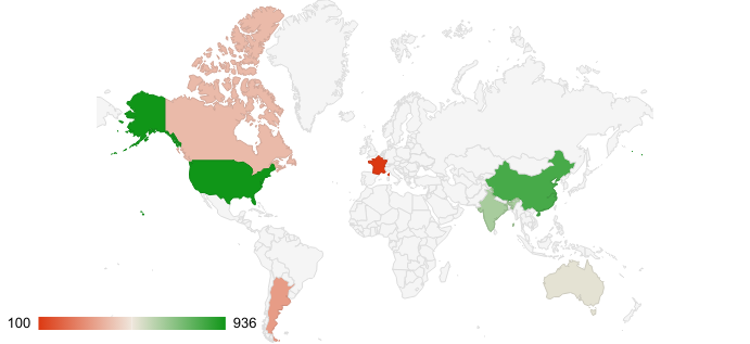
You can see how much revenue and expenditure overlap in the region graphic above and get an idea of where the maximum sales are coming from.
An organization can use additional styles and a combination of charts and graphs to drill down to the finite details to produce the most information from the data.
Storytelling with Data Visualization
Data Visualization is a subject that blends art and science and calls for solid designing, computational, and statistical abilities. Data Visualization serves as a link between raw data and its graphic representation of it. Combining visuals and stories, Data Storytelling is a technique for illuminating what is occurring in your dataset.
In various graphical terms, numerous variables are compared, and their interactions are noted and shown. Complex data becomes easier to interpret and more aesthetically beautiful as a result.
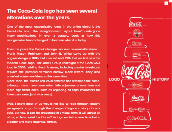
The “simple” story of how the iconic soft drink brand Coca-Cola changed over time illustrates Data Storytelling at its finest:
By Lyle Opolentisima | source- dailyinfographic
Conclusion
A Data Visualization expert, Nathan Yau, says that good visualization is “a representation of data that helps you see what you would otherwise have been blind to if you looked only at the naked source.”
Because they can successfully summarize enormous volumes of data in an understandable graphical format, Data Visualization techniques are essential to data analysis. Many Data Visualization styles exist, each with unique benefits, drawbacks, and applications. Choosing the appropriate graphic to represent your facts is the most challenging step. Several variables will influence your decision, including the conclusion you want to make, your audience, the critical metrics, etc.
We would be delighted to discuss your use case and explore how DBSync can support your success. Please feel free to Schedule a meeting with us.
FAQs
What is data visualization, and why is it important?
Data visualization is the art and science of presenting data visually to enhance accessibility and comprehension. It’s crucial for spotting trends, insights, and patterns in data, aiding faster decision-making.
How does data visualization improve productivity?
By displaying KPIs and metrics on simple dashboards, data visualization reduces the need for lengthy reports, allowing employees to focus on business problems and make informed decisions quickly.
What are some common types of data visualization charts?
Common types include line graphs (trends over time), bar charts (comparisons), pie charts (proportions), area charts (quantity changes), bubble charts (three-dimensional data), and map charts (geographical data).
How does data visualization help with big data?
Data visualization tools uncover hidden patterns, relationships, and insights in large datasets, making it easier to analyze and interpret complex data efficiently.
What is data storytelling in the context of data visualization?
Data storytelling combines visuals and narratives to explain what’s happening in a dataset, making complex data more interpretable and engaging through graphical representations.